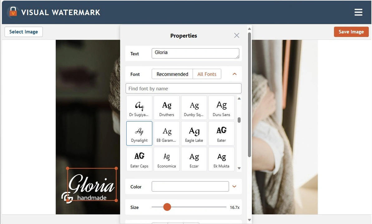
If you are thinking about designing your own logo using free online services, first, you’ll need to decide which fonts you’ll want to use. The choice of a font directly affects the way your logo – and therefore, your brand – is perceived. It is recommended to use no more than 2 different fonts: one for the company name and one for the slogan.
Are you afraid of being at loss when the time to choose fonts for your logo comes? That’s totally fine. Don’t worry. We’re here to help! Below you will find the main recommendations for choosing a font.
There are 4 main types of logo fonts:
- Serif fonts. They have small, decorative flicks at the ends of each stroke. These fonts have become popular thanks to their readability and their form that is visually pleasing. Here are some examples of serif fonts – Arapey, Cardo, Times New Roman, Lora, Caslon, Garamond, and others.
- Sans serif fonts. Any font that does not have tiny dashes, indents, and extensions at the tips of its characters falls into this category. Sans serif fonts are often used for logos published online due to their excellent screen readability. They are more minimalistic and easy to understand, therefore they will be perfect for a slogan. Here are few examples: Roboto, Oswald, Signika, Sarabun, Prompt.
- Script or cursive fonts. These fonts look like they were written by hand. These fonts will be perfect if the unusualness of your logo is more important to you than its readability. Script font will surely make your brand stand out from others. But please note that in a logo, cursive fonts should be used only for one word. For instance, for the brand name. Don’t use them for slogans and small-sized strings of text; otherwise, people will have a hard time reading them. In Visual Watermark app, you can find the following cursive fonts: Great Vibes, Alex Brush, Dancing Script, Playball, Allura and much more.
- Display fonts. These are decorative fonts that have a unique design. They can be big, bold or quirky. Just like script fonts, in a logo, it’s best to use display fonts to draw attention to the brand name and in a combination with minimalistic fonts. The 3D-styled and vintage fonts also fall into this category. Here are few examples: Neon Show, Monoton, Porter Sans Block, Poster Boy etc.

Few Options of Combining Different Fonts in Your Logo:
Serif font for the brand name or main logo text + sans serif font for the slogan.
Script font for the brand name or main logo text + sans serif font for the slogan.
Display font for the brand name or main logo text + sans serif font for the slogan.
How You Can Improve the Legibility of Your Logo on a Photo:
- Add some contrast. Light-colored letters on a light-colored background tend to be almost invisible. To avoid this, increase the contrast of your logo. This can be done by adding a shadow or placing your logo against a dark-colored background.
- Be careful when using script or decorative fonts. For better perception, it is necessary to add some free space. This means that you need to increase the space between letters or lines of text in your logo. This can be done without much effort as there are options for adjusting the line height and the size of the text itself.
- Use a thin font in a logo that has a symbol or a monogram. This will allow you to change up your logo more easily, if necessary. For instance, if you notice that the thin font of your choice looks small and unattractive on a photo, you will be able to discard the textual part and leave just the monogram or symbol.
If you want to design a logo from scratch, you can use one of the free online logo makers. Here is an informative article with an overview of different websites for that - The best logo makers for photographers.
If you have already decided on a font and want to quickly check if it’s included in our app, use the search bar “Find font by name”.
 Visual Watermark
 by
by 